Watching letters
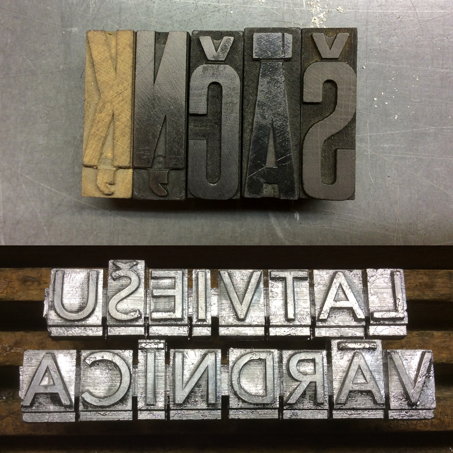
Aleksandra Samuļenkova


[1]
Text
There is only one diacritical mark in my name: a small comma accent dangling below the letter “ļ.” For me, a person bearing a Russian name, the significance of this diacritical mark is disproportionate to the mark’s modest size. At the brink of 2024, this tiny accent below the Latvian letter “ļ” in my name has become a kind of typographic insignia, indicating my background, state affiliation, and value system.
Diacritical marks can hold a significance that is deeper than their mere function, not only for individuals like me, but for large social groups—sometimes for entire nations.
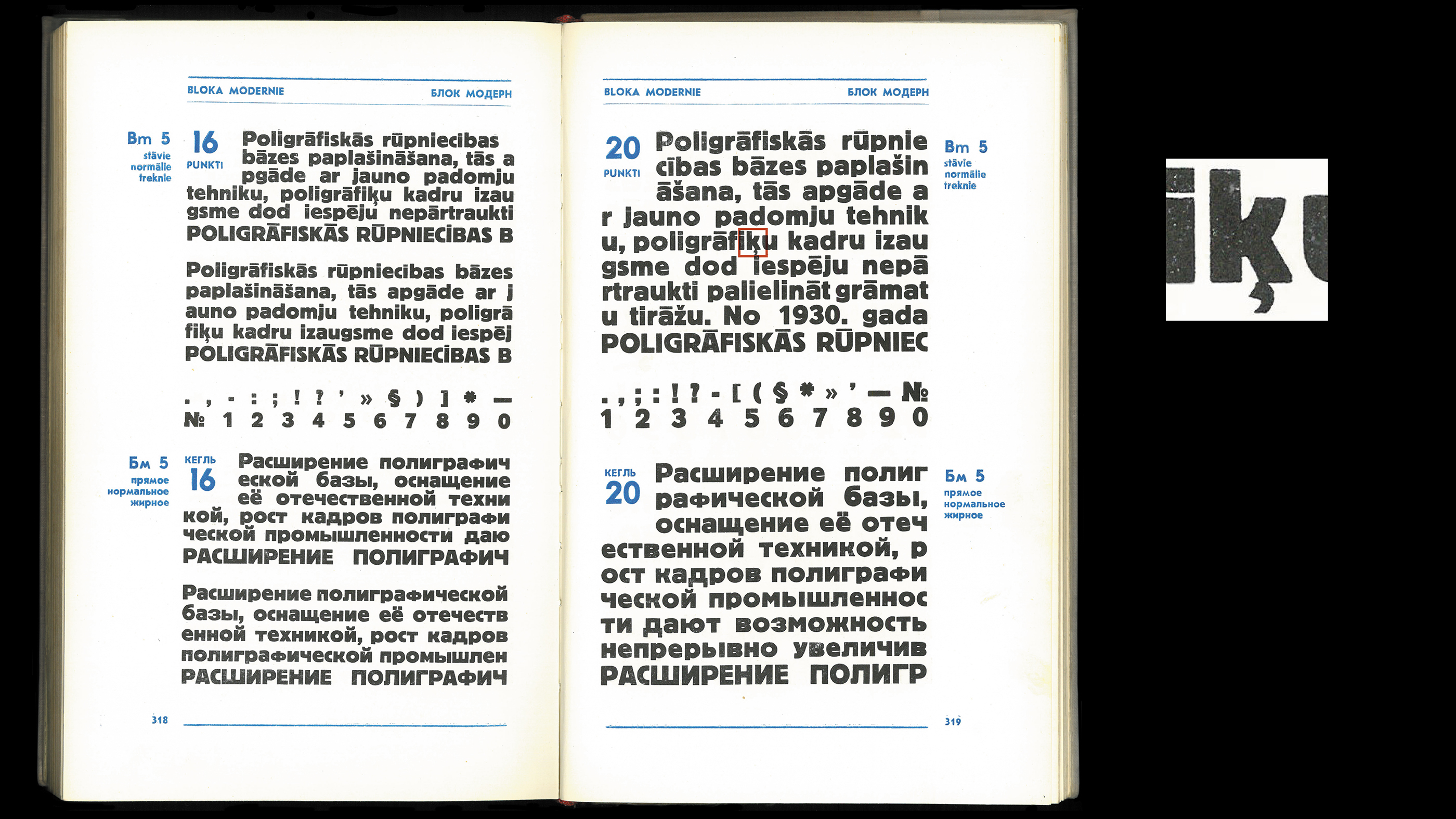
Those who have dealt with diacritically rich orthographies, are likely to know that diacritics can be quite a nuisance. These marks often stick out and clash with other glyphs. And if diacritics do not cause such issues, it is usually because they are not sufficiently noticeable, which also impedes the readability of a text.
In the era of mechanical typesetting, diacritical marks often incurred additional expenses for the printer. These fine and finicky elements wore out faster than the rest of the metal letters, or simply broke off.
To this day, accents often require more space between lines of text, affecting design decisions when working with certain orthographies based on the Latin script.
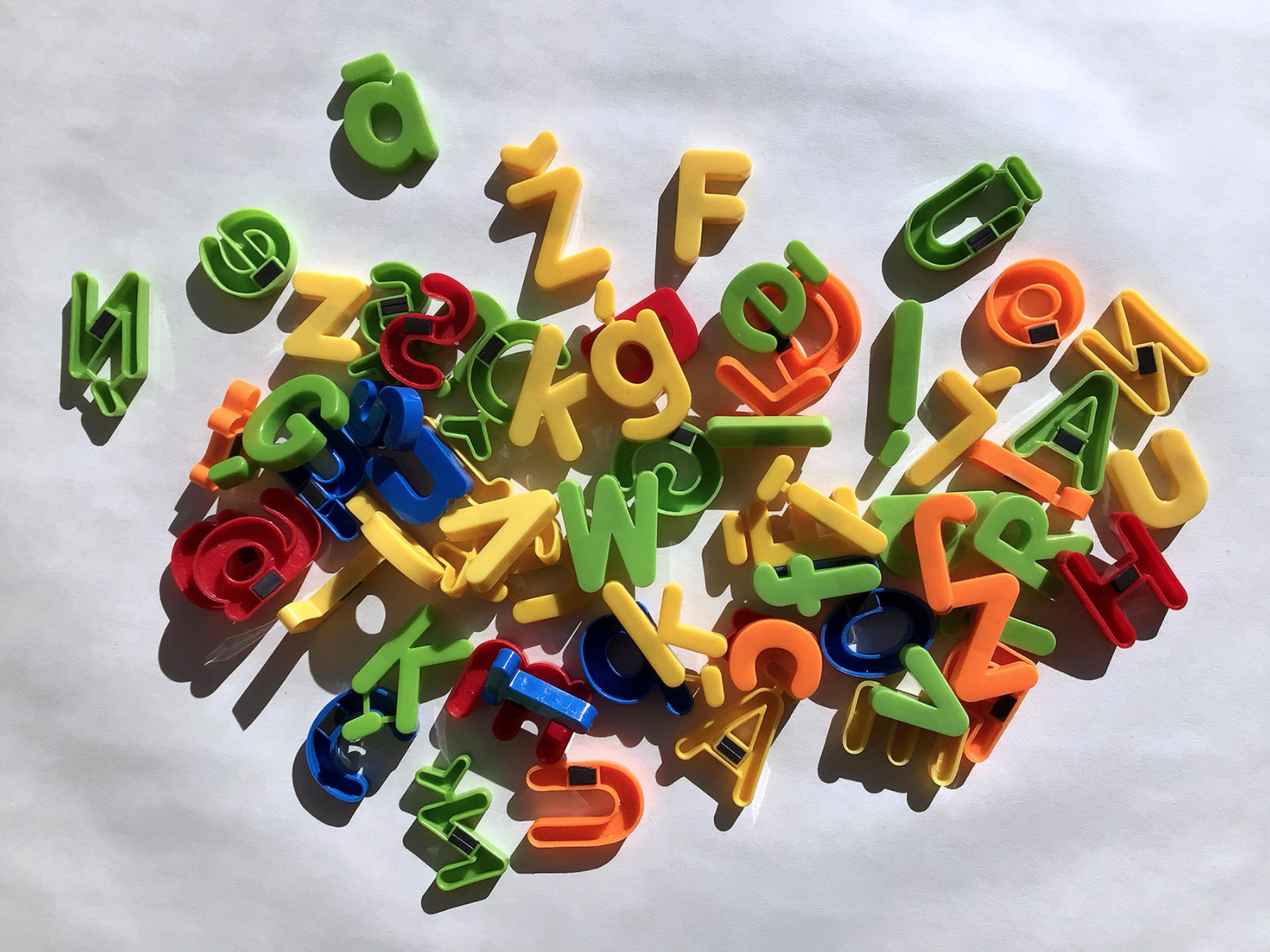
Diacritical marks in letterpress printing.
Despite the typographic challenges posed by diacritics, their implementation allowed numerous nations to uncompromisingly render their native languages in writing for the first time in their existence. Diacritical marks have become integral components of the Latin-script phonemic1 orthographies.
At the turn of the twentieth century, various parts of Europe experienced an unmatched awakening of national consciousness that resulted in the formation of several new states after World War I. This process unfolded in a consistently similar manner for different European nations. Among the fundamental political and sociocultural transformations, the orthographic reforms were also carried out.
During that time, written Latvian underwent two significant modifications: the adoption of Roman types in place of Blackletter and the abolition of the old orthography based on the German spelling in favor of a new, phonemic one.
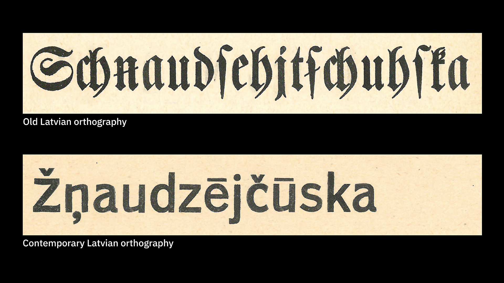
The advantages of the phonemic orthography where one sound = one grapheme.
Contemporary, phonemic Latvian orthography: Žņaudzējčūska
Old Latvian orthography based on the German spelling: Schnaudzehjtschuhska
German missionaries introduced a slightly altered version of the German orthography for written Latvian in the 16th century. For a long time after that, the Baltic Germans, the region’s land-owning and ruling elite, were the sole authority responsible for the development and systematization of written Latvian.
G. F. Stender, Neue Vollständige Lettische Grammatik, 1761.
‘Because the Latvians do not have their own writing system, one uses the Latin letters for writing something in Latvian, but the German letters for anything printed.
And for just this reason we, Germans, have defined the Latvian orthography exactly based on the pronunciation of the Latvians.’

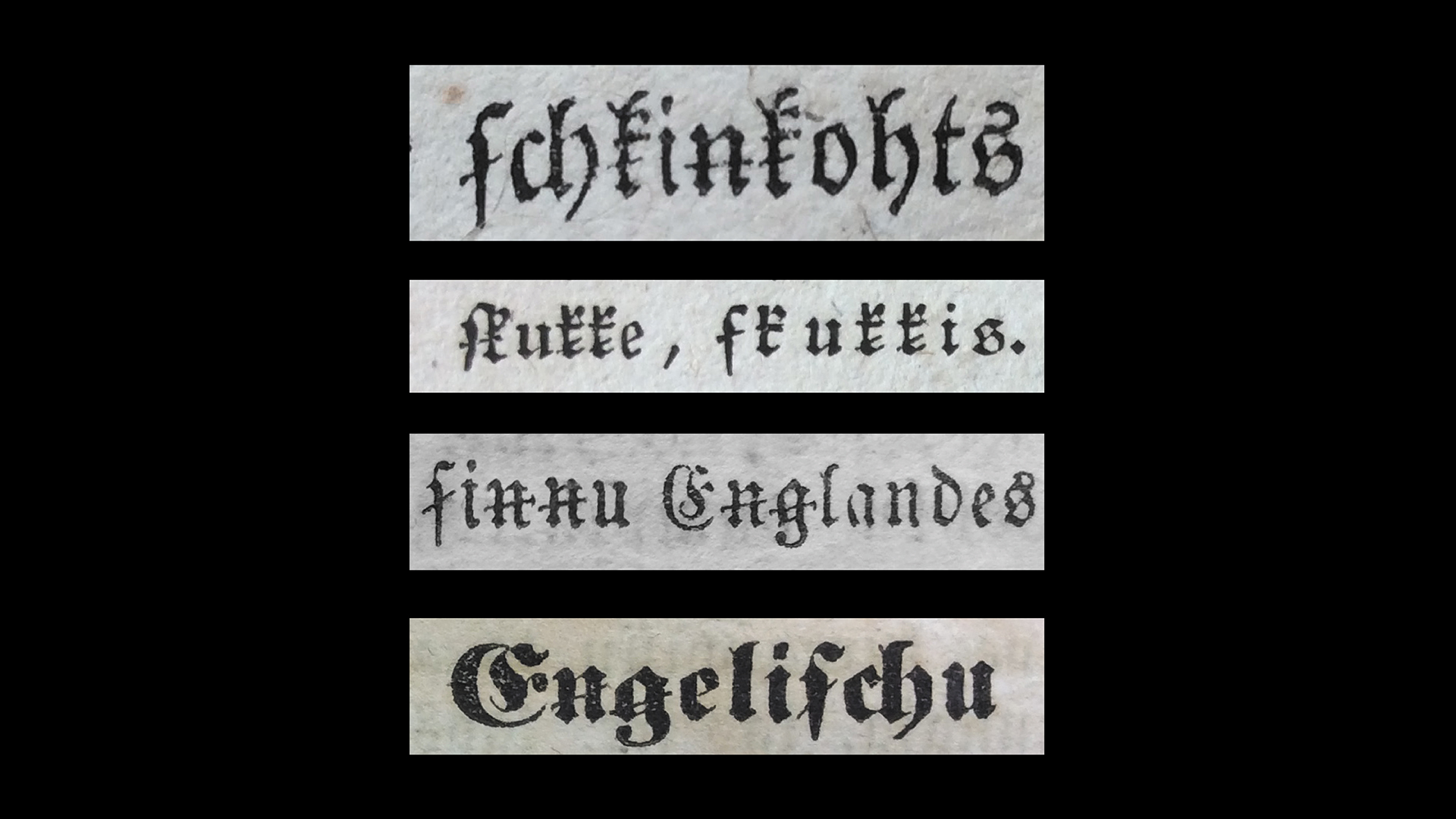
Alas, German orthography, even when adapted for the Latvian language, resulted in bulky constructions. Too many Latvian phonemes had to be represented by clusters of two, three, or even four letters. A virgule (a stroke through a letter) was employed to differentiate some of these phonemes, but even then, certain characteristics of spoken Latvian were completely unrepresented in its written form.
The eccentrically intense use of virgules in the old Latvian orthography.
When the major sociopolitical shifts of the 19th century gave Latvians a newfound agency with respect to their nation’s fate, the young Latvian intelligentsia decisively wrested control over linguistic matters from the Baltic German elites.
The reluctance of the Baltic Germans to relinquish control over Latvian cultural matters on the one hand, coupled with the aggressive Russification policies of the Russian Empire on the other, prompted the Latvians to seek an alternative to any form of cultural patronage.
The national awakening process had an impact on every aspect of Latvians’ lives, including typography. The aforementioned inadequacies of German orthography for written Latvian became a ubiquitous reminder to Latvians of their subordinate position in the recent past. Blackletter itself became a symbol of the cultural dominance exercised by the Baltic German elite. Thus, at the beginning of the 20th century, not only the Latvian language itself, but also the way it was graphically depicted, became a crucial consideration in the formation of a national identity.
The Latvians’ orthographic and typographic consciousness was inspired by another European nation struggling for autonomy. The Czechs, who have long been champions of phonemic orthography, have made a significant contribution to the contemporary appearance of written Baltic languages.
The 15th-century treatise De orthographia bohemica, which is attributed to Jan Hus, a key figure of the Bohemian Reformation, can be read as a manifesto in favor of phonemic orthography and the use of the accented letters instead of bulky digraphs and trigraphs in the Czech language. This document marks the beginning of the diacritical enrichment of European languages, a process that was sustained by the subsequent Protestant Reformation. This movement encouraged the translation of religious literature into vernacular languages, thereby necessitating the development of a suitable means of rendering those languages in written form.
De orthographia bohemica introduced, among other things, the diacritical mark caron (ˇ), also known by its Czech name haček. This particular accent has since permeated not only various Slavic languages but also Latvian and Lithuanian. The integration of the caron into Baltic languages was accomplished due to the involvement of Josef Zubatý, another exceptional Czech figure. Zubatý, a multifaceted linguist, etymologist, and ardent advocate of Czech literary language, possessed a keen interest in both Latvian and Lithuanian. In fact, he became fluent in both languages, and for many years maintained a correspondence with Kārlis Mīlenbahs, one of the founders of Latvian linguistics and lexicography.
As in several other European nations, the mid-19th century found Latvians beginning to exert influence over their written language. This process culminated on January 25, 1908, when the Scientific Committee of the Riga Latvian Society established the Orthographic Commission to oversee the orthographic reform of the Latvian language. The general public became involved in the debates through the press, and showed considerable enthusiasm for the issue.
A pivotal article by the Orthographic Commission appeared on the front page of the Latwija newspaper on June 21, 1908. The article introduced Commission’s proposed reform, which included a transition to Roman type and the use of diacritical marks. The paper invited readers to participate in a questionnaire regarding their orthographic preferences.
Latwija, Nr. 142, 1908
Open image in a new window to see details
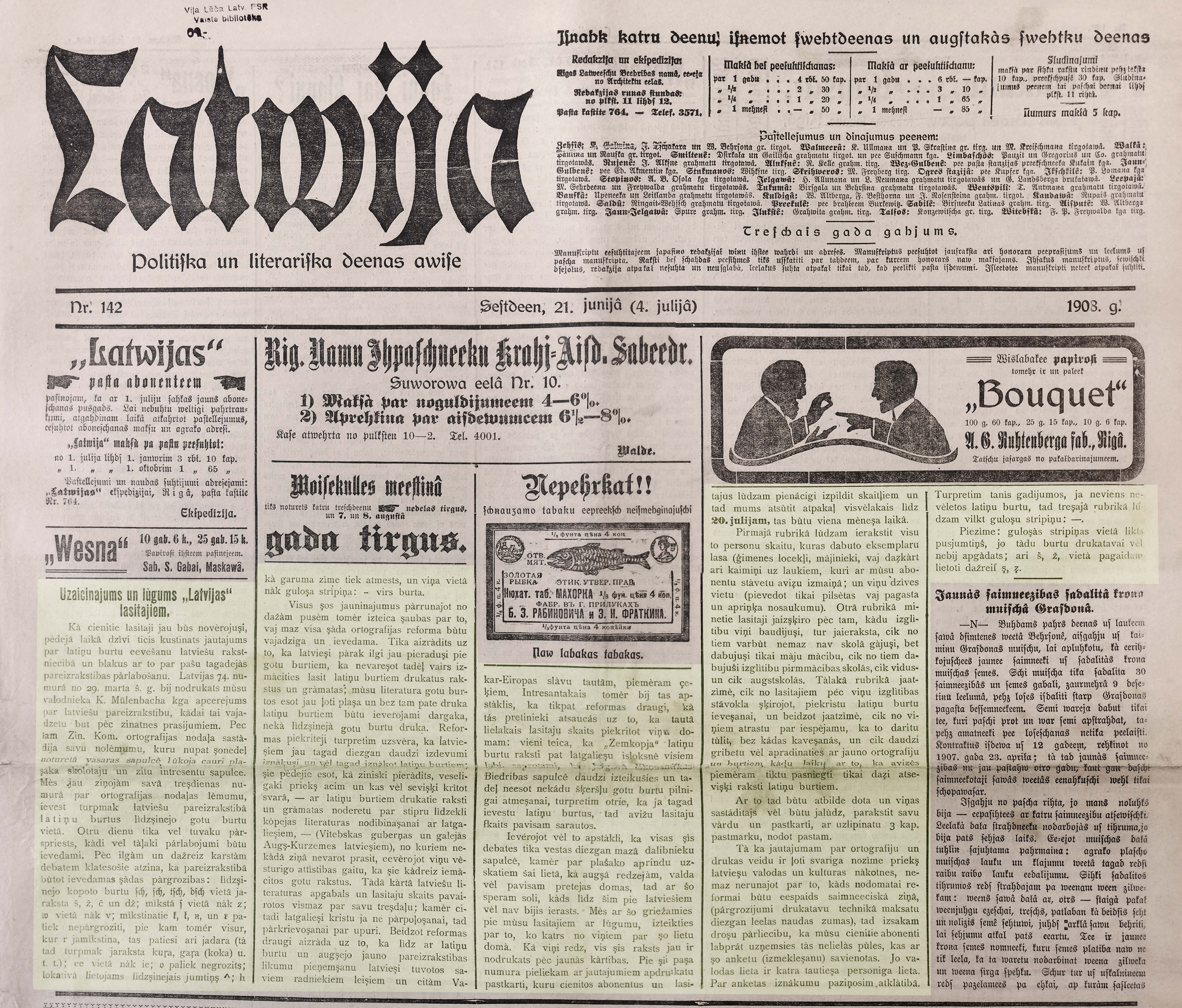
At that time, Latwija was still printed in Blackletter type, but this article was typeset in Roman and used the new orthography with diacritics. Ironically, some letters with diacritics were not available at the printing house, and the ones that were available were not in sufficient quantities. Thus, the macron (¯), the accent shaped as a horizontal line above a letter, indicating the vowel’s length was replaced by the circumflex (ˆ). In some words, the cedilla (¸) below the letter was used instead of the caron (ˇ) above it. The last paragraph of the article explained the constraints that compelled these substitutions to its readers.
As much as I would like to call this article in the 142nd issue of Latwija a happy ending to the story of Latvian orthographic journey, the article itself would contradict me. A set of metal type was a heavy, yet fragile object that was expensive to produce and to distribute. The printers were often unable to invest in new Roman types to replace the Blackletter ones. And new letters featuring diacritics, which were not employed in other languages at that time, such as macron, had to be produced. Despite the official introduction of this new orthography into Latvian schools in 1909, printed materials in Latvian were not orthographically or typographically consistent. The spelling, style of the letters, as well as the shape and placement of the diacritical marks varied significantly, depending on the availability of certain letters in the printer’s collection. Furthermore, designers were not yet restricted by ingrained ideas regarding the appearance of these letters.
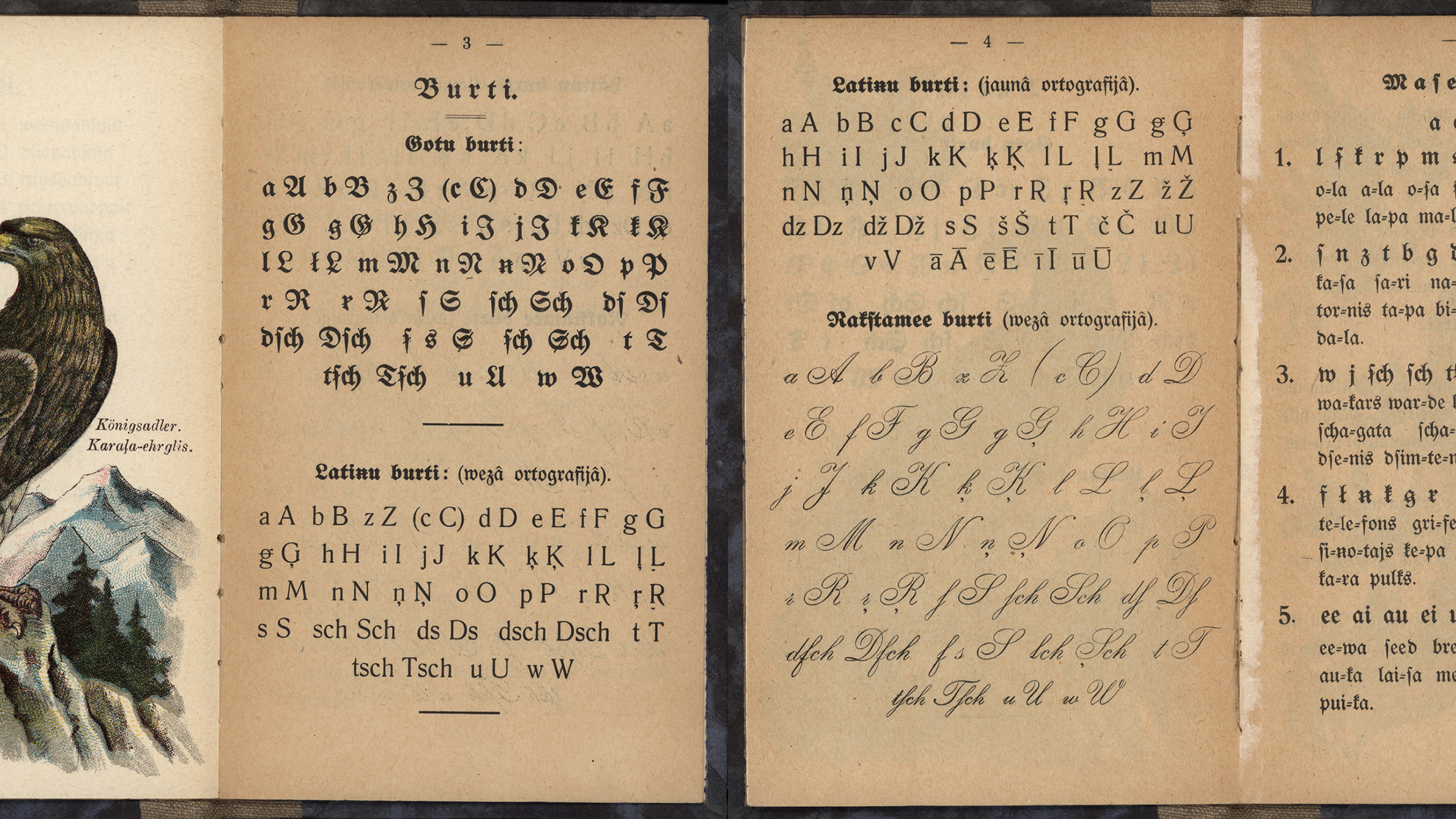
The medley of ways in which Latvian was represented in print during the early 20th century necessitated that the children’s primers include several of the most common variations, including Blackletter type with the new orthography and Roman type with the pre-reform orthography.
Bilžu ābece rātniem bērniem. Rīga. Dzintars, 1921. (Picture primer for obedient children)
The hardships brought on by the First World War were not conducive to furthering the typographic advancements of the Latvian language. However, it is plausible that the Blackletter types, which were still prevalent at the time, were required to be smelted and recast into ammunition during the war, possibly precipitating the spread of Roman types in the following years.
Nonetheless, even after Latvia declared its independence in 1918 and the Prime Minister signed the orthography decree in 1922, some of this orthographic and typographic disorder persisted for several decades.
Covers featuring various interpretations of the same diacritical mark beneath a letter.
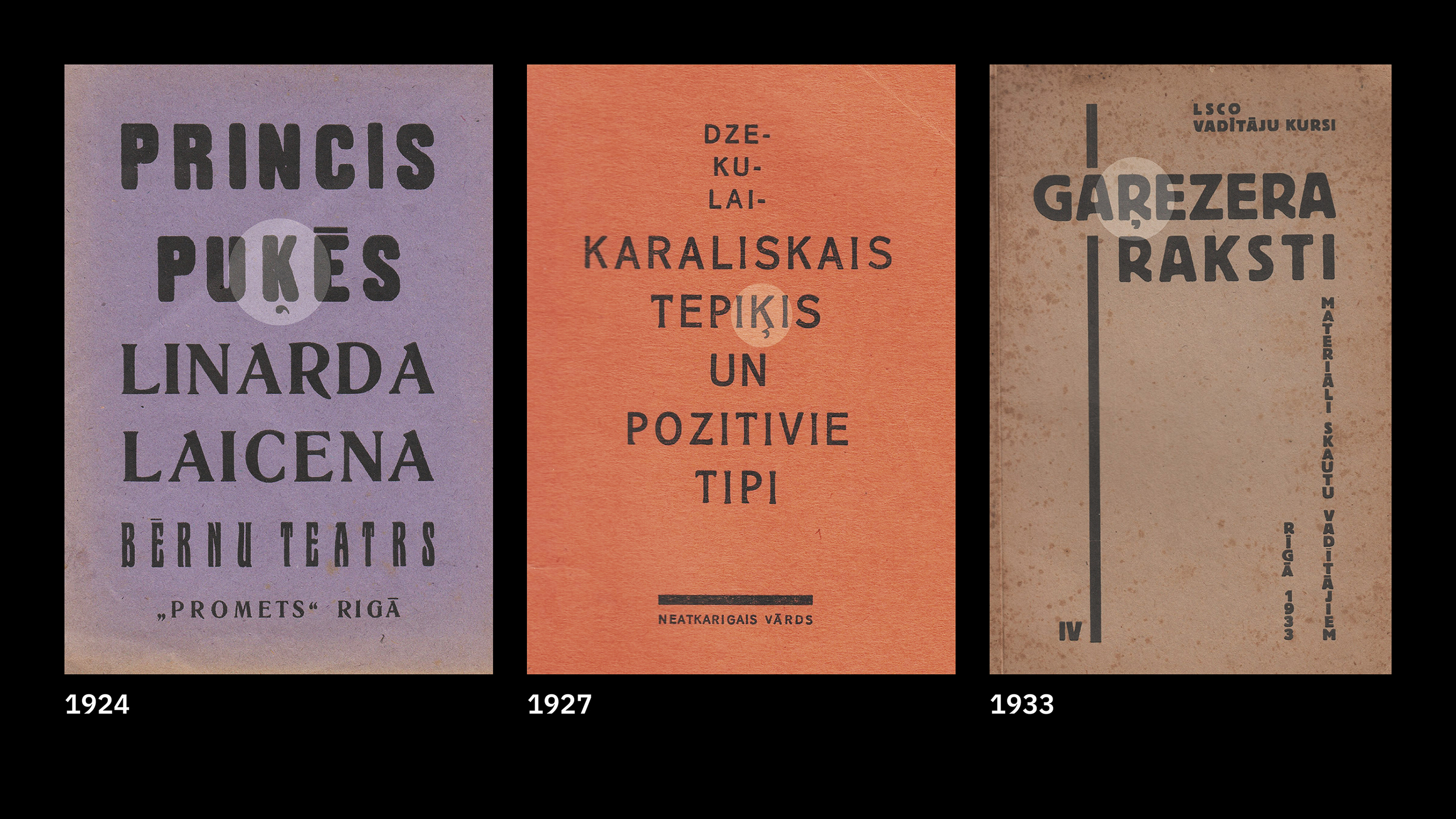
The virgule, a remnant of the old Latvian orthography, lingered in Latvian print for quite a while.
In Memory of the First President of Latvia: Jānis Čakste, 1928
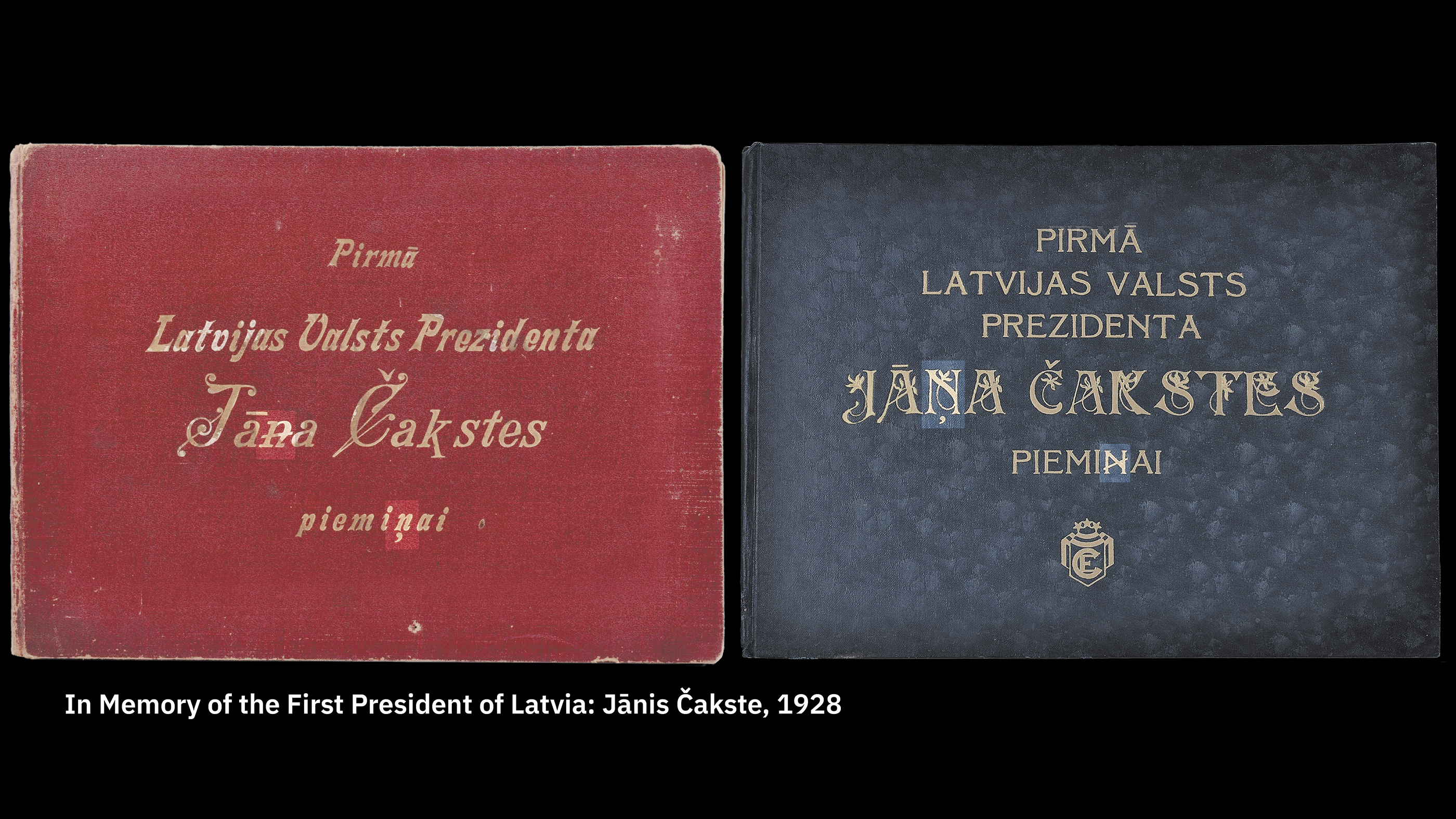
For a long time, the successor to the virgule, a diacritical mark below the letters “Ģ,” “Ķ,” “Ļ,” “Ņ,” and “Ŗ”, has existed in two distinct forms. Since the second half of the nineteenth century Latvian print featured both a cedilla connected to the base letter and a disconnected comma accent—sometimes even on the same page.
Vālodzīte. Bilžu ābece, 192?

The connected cedilla can be found in Soviet type catalogues.
LPSR Ministru Padomes Preses komitija Centrālā cinkogrāfija.
Burtu katalogs, 1971
Despite the fact that the detached comma accent has been the preferred shape of this diacritic in Latvia for the past few decades, the cedilla has been adopted in the official name of the Unicode characters representing these letters, still causing confusion among novice type designers. Adding to the confusion, some of these characters are used in the Marshallese alphabet, and a detached cedilla is the preferred form for the Marshallese.
One would expect the conventional idea of legible and readable typography to change rather slowly, given that this discipline is directly related to the old and complex phenomenon of reading. However, having emerged in response to significant historical events, Latvian diacritics have become a ubiquitous component of daily life rather swiftly.
“You read best what you read most” states Zuzana Licko, an eminent Slovak-American type designer and cofounder of Emigre type foundry. Licko argues that the lettershapes we read most easily are those that we have read many times before. In other words, the reading comfort depends primarily on the reader’s habit, and to a lesser degree on the objective virtues of the particular typeface employed.
Licko’s maxim is occasionally inverted by type designers who don’t quite agree with her perspective. According to them, “We read most what we read best,” meaning that readers gravitate toward lettershapes that are comfortable for them to read, and thus read them more often.
The tension between these opposing conceptions amounts to a kind of typographic chicken-and-egg situation. Yet, I believe there is another possible scenario: “We read best and most what we are motivated to read.” Large groups of people may be willing to drastically change their reading habits over a relatively short period of time, provided that they are sufficiently motivated by matters beyond the reading itself.
A phonemic orthography is an orthography in which graphemes (written symbols) correspond to the language’s phonemes (the smallest units of speech).
[1]
A phonemic orthography is an orthography in which graphemes (written symbols) correspond to the language’s phonemes (the smallest units of speech).